Cisco-opplæring

Insoft Services er en av få opplæringsleverandører i EMEAR som tilbyr hele spekteret av Cisco-sertifisering og spesialisert teknologiopplæring.

Les mer

Cisco Sertifisering

Opplev en blandet læringstilnærming som kombinerer det beste av instruktørledet opplæring og e-læring i eget tempo for å hjelpe deg med å forberede deg til sertifiseringseksamen.

Les mer

Cisco Learning Credits

Cisco Learning Credits (CLC) er forhåndsbetalte opplæringskuponger innløst direkte med Cisco som gjør planleggingen for suksessen din enklere når du kjøper Cisco-produkter og -tjenester.

Les mer

Etterutdanning

Cisco Continuing Education Program tilbyr alle aktive sertifiseringsinnehavere fleksible alternativer for å resertifisere ved å fullføre en rekke kvalifiserte opplæringselementer.

Les mer

Cisco Digital Learning

Sertifiserte ansatte er verdsatte eiendeler. Utforsk Ciscos offisielle digitale læringsbibliotek for å utdanne deg gjennom innspilte økter.

Les mer

Cisco Business Enablement

Cisco Business Enablement Partner Program fokuserer på å skjerpe forretningsferdighetene til Cisco Channel Partners og kunder.

Les mer

Cisco opplæringskatalog

Les mer

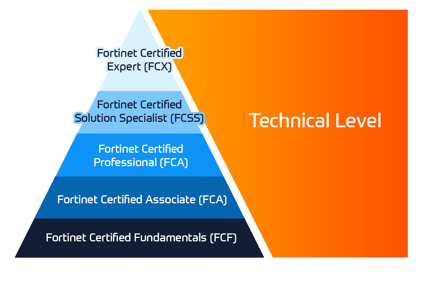
Fortinet Sertifisering

Fortinet Network Security Expert (NSE)-programmet er et opplærings- og sertifiseringsprogram på åtte nivåer for å lære ingeniører om nettverkssikkerheten for Fortinet FW-ferdigheter og -erfaring.

Tekniske kurs

Fortinet-opplæring

Insoft er anerkjent som Fortinet Autorisert Opplæringssenter på utvalgte steder i EMEA.

Les mer

Fortinet opplæringskatalog

Utforsk et bredt utvalg av Fortinet Schedule på tvers av forskjellige land så vel som online kurs.

Les mer

ATC-status

Sjekk atc-statusen vår på tvers av utvalgte land i Europa.

Les mer

Pakker for Fortinet-tjenester

Insoft Services har utviklet en spesifikk løsning for å effektivisere og forenkle prosessen med å installere eller migrere til Fortinet-produkter.

Les mer

Microsoft-opplæring

Insoft Services gir Microsoft opplæring i EMEAR. Vi tilbyr Microsofts tekniske opplærings- og sertifiseringskurs som ledes av instruktører i verdensklasse.

Tekniske kurs

Extreme-opplæring

Lær eksepsjonell kunnskap og ferdigheter i ekstreme nettverk.

Les mer

Teknisk sertifisering

Vi tilbyr omfattende læreplan over tekniske kompetanseferdigheter om sertifiseringsprestasjonen.

Les mer

Extreme opplæringskatalog

Tekniske kurs

ATP-akkreditering

Som autorisert opplæringspartner (ATP) sørger Insoft Services for at du får de høyeste utdanningsstandardene som er tilgjengelige.

Les mer

Løsninger og tjenester

Vi tilbyr innovativ og avansert støtte for design, implementering og optimalisering av IT-løsninger. Vår kundebase inkluderer noen av de største Telcos globalt.

Les mer

Globalt anerkjent team av sertifiserte eksperter hjelper deg med å gjøre en jevnere overgang med våre forhåndsdefinerte konsulent-, installasjons- og migrasjonspakker for et bredt spekter av Fortinet-produkter.

Om oss

Insoft Tilbyr autoriserte opplærings- og konsulenttjenester for utvalgte IP-leverandører. Finn ut hvordan vi revolusjonerer bransjen.

Les mer
  • +47 23 96 21 03
  • Data Visualization with Python

    Duration
    3 Dager
    Delivery
    (Online Og På stedet)
    Price
    Pris på forespørsel
    With so much data being continuously generated, developers with a knowledge of data analytics and data visualization are always in demand. With Data Visualization with Python, you'll learn how to use Python with NumPy, Pandas, Matplotlib, and Seaborn to create impactful data visualizations with real-world, public data. This Data Visualization with Python course takes a hands-on approach to the practical aspects of using Python to create effective data visuals. It contains multiple activities that use real-life business scenarios for you to practice and apply your new skills in a highly relevant context.  

    Lesson One: Importance of data visualization and data exploration

    • Topic 1: Introduction to data visualization and its importance
    • Topic 2: Overview of statistics
      • Activity 1: Compute mean, median, and variance for the following numbers and explain the difference between mean and median
    • Topic 3: A quick way to get a good feeling for your data
    • Topic 4: NumPy
      • Activity 1: Use NumPy to solve the previous activity
      • Activity 2: Indexing, slicing, and iterating
      • Activity 3: Filtering, sorting, and grouping
    •  Topic 5: Pandas
      • Activity 1: Repeat the NumPy activities using pandas, what are the advantages and disadvantages of pandas?


    Lesson Two: All you need to know about plots

    • Topic 1: Choosing the best visualization
    • Topic 2: Comparison plots
      • Line chart
      • Bar chart
      • Radar chart
      • Activity 1: Discussion round about comparison plots
    •  Topic 3: Relation plots
      • Scatter plot
      • Bubble plot
      • Heatmap
      • Correlogram
      • Activity 1: Discussion round about relation plots
    •  Topic 4: Composition plots
      • Pie chart
      • Stacked bar chart
      • Stacked area chart
      • Venn diagram
      • Activity 1: Discussion round about composition plots
    •  Topic 5: Distribution plots
      • Histogram
      • Density plot
      • Box plot
      • Violin plot
      • Activity 1: Discussion round about distribution plots
    •  Topic 6: Geo plots
    • Topic 7: What makes a good plot?
      • Activity 1: Given a small dataset and a plot, reason about the choice of visualization and presentation and how to improve it


    Lesson 3: Introduction to NumPy, Pandas, and Matplotlib

    • Topic 1: Overview and differences of libraries
    • Topic 2: Matplotlib
    • Topic 3: Seaborn
    • Topic 4: Geo plots with geoplotlib
    • Topic 5: Interactive plots with bokeh


    Lesson 4: Deep Dive into Data Wrangling with Python

    • Topic 1: Matplotlib
    • Topic 2: Pyplot basics
    • Topic 3: Basic plots
      • Activity 1: Comparison plots: Line, bar, and radar chart
      • Activity 2: Distribution plots: Histogram, density, and box plot
      • Activity 3: Relation plots: Scatter and bubble plot
      • Activity 4: Composition plots: Pie chart, stacked bar chart, stacked area chart, and Venn diagram
    • Topic 4: Legends
      • Activity 1: Adding a legend to your plot
    • Topic 5: Layouts
      • Activity 1: Displaying multiple plots in one figure
    • Topic 6: Images
      • Activity 1: Displaying a single and multiple images
    • Topic 7: Writing mathematical expressions


    Lesson 5: Simplification through Seaborn

    • Topic 1: From Matplotlib to Seaborn
    • Topic 2: Controlling figure aesthetics
      • Activity 1: Line plots with custom aesthetics
      • Activity 2: Violin plots
    • Topic 3: Color palettes
      • Activity 1: Heatmaps with custom colour palettes
    • Topic 4: Multi-plot grids
      • Activity 1: Scatter multi-plot
      • Activity 2: Correlogram


    Lesson 6: Plotting geospatial data

    • Topic 1: Geoplotlib basics
      • Activity: Plotting geospatial data on a map
      • Activity: Choropleth plot
    • Topic 2: Tiles providers
    • Topic 3: Custom layers
      • Activity: Working with custom layers


    Lesson 7: Making things interactive with Bokeh

    • Topic 1: Bokeh basics
    • Topic 2: Adding Widgets
      • Activity 1: Extending plots with widgets
    • Topic 3: Animated Plots
      • Activity 1: Animating information


    Lesson 8: Combining what we’ve learned

    • Topic 1: Recap
    • Topic 2: Free exercise
      • Activity 1: Given a new dataset, the students have to decide in small groups which data they want to visualize and which plot is best for the task.
      • Activity 2: Each group gives a quick presentation about their visualizations.


    Lesson 9: Application in real life and Conclusion of course

    • Applying Your Knowledge to a Real-life Data Wrangling Task
    • An Extension to Data Wrangling

    Data Visualization with Python is designed for developers and scientists, who want to get into data science or want to use data visualizations to enrich their personal and professional projects.

    You do not need any prior experience in data analytics and visualization, however, it’ll help you to have some knowledge of Python and familiarity with high school level mathematics. Even though this is a beginner level course on data visualization, experienced developers will be able to improve their Python skills by working with real-world data.

    Hardware:

    For the optimal student experience, we recommend the following hardware configuration:

    • OS: Windows 7 SP1 32/64-bit, Windows 8.1 32/64-bit or Windows 10 32/64- bit, Ubuntu 14.04 or later, or macOS Sierra or later
    • Processor: Dual Core or better
    • Memory: 4GB RAM
    • Storage: 10 GB available space software
    • Browser: Google Chrome or Mozilla Firefox
    • Conda
    • JupyterLab and Jupyter Notebook
    • Sublime Text (latest version), Atom IDE (latest version), or other similar text editor applications
    • Python 3
    • The following Python libraries installed: NumPy, pandas, Matplotlib, seaborn, geoplotlib, Bokeh, and squarify


    Installation and Setup

    • Before you start this course, we’ll install Python 3.6, pip, and the other libraries used throughout this course. You will find the steps to install them here.


    Installing Python


    Installing pip

    You might need to use the python3 get-pip.py command, due to previous versions of Python on your computer that already use the python command.


    Installing libraries

    Using the pip command, install the following libraries:

    • python -m pip install -user numpy matplotlib jupyterlab pandas squarify
    • bokeh geoplotlib seaborn


    Working with JupyterLab and Jupyter Notebook

    You can either download it using GitHub or as a zipped folder by clicking on the green Clone or download button on the upper-right side.

    In order to open Jupyter Notebooks, you have to traverse into the directory with your terminal. To do that, type:

    • cd Data-Visualization-with-Python/<your current lesson>

    For example cd Data-Visualization-with-Python/lesson01/

    To complete the process, perform the following steps:

    1. To reach each activity and exercise, you have to use cd once more to go into each folder, like so: cd Activity01
    2. Once you are in the folder of your choice, simply call jupyter-lab to start up JupyterLab. Similarly, for Jupyter Notebook, call jupyter notebook.


    Importing Python Libraries

    • Every exercise and activity in this course will make use of various libraries.


    Importing libraries into Python is very simple and here’s how we do it:

    1. To import libraries, such as NumPy and pandas, we have to run the following code. This will import the whole numpy library into our current file: import numpy # import numpy
    2. In the first cells of the exercises and activities of this courseware, you will see the following code. We can use np instead ofnumpy in our code to call methods from numpy: import numpy as np # import numpy and assign alias np
    3. In later lessons, partial imports will be present, as shown in the following code. This only loads the mean method from the library: from numpy import mean # only import the mean method of numpy
      Datoer
      Date on Request

    Follow Up Courses

    Filtrer
    • 3 Dager
      Date on Request
      Price on Request
      Book Now
    • 3 Dager
      Date on Request
      Price on Request
      Book Now
    • 5 Dager
      Date on Request
      Price on Request
      Book Now
    • 5 Dager
      Date on Request
      Price on Request
      Book Now
    • 3 Dager
      Date on Request
      Price on Request
      Book Now
    • 4 Dager
      Date on Request
      Price on Request
      Book Now
    • 5 Dager
      Date on Request
      Price on Request
      Book Now
    • 5 Dager
      Date on Request
      Price on Request
      Book Now
    • 4 Dager
      Date on Request
      Price on Request
      Book Now
    • 2 Dager
      Date on Request
      Price on Request
      Book Now

    Know someone who´d be interested in this course?
    Let them know...

    Use the hashtag #InsoftLearning to talk about this course and find students like you on social media.